

Art Deco Jewellery Design: Geometry in Gold
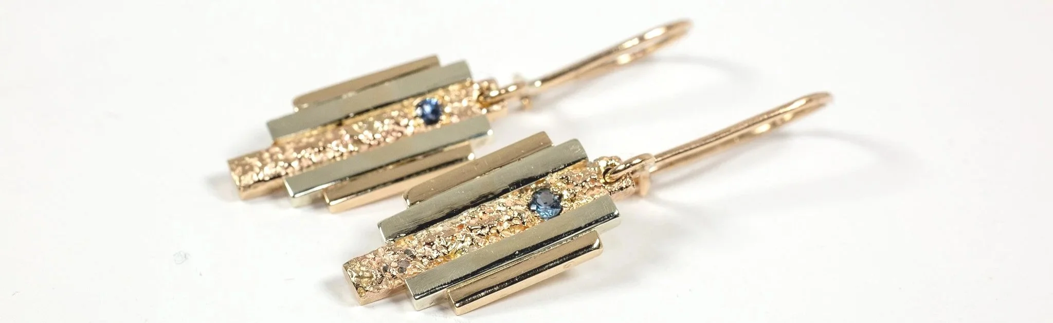
Art Deco jewellery reads clearly from across a room, and geometry underlines the words. A century after the style crystallised, its signature is still a straight line set against a curve, a stone placed at the exact centre of a symmetrical frame, a stepped edge that refuses to soften. Those choices are not decoration laid on top of a design. They are the structure itself, which is why the style transfers so readily into new work.
For a working goldsmith, the useful question is not what Art Deco looked like but how its geometry behaves when it is modelled, cast and finished in gold today. The answers sit in proportion, in step profiles, in lattice forms borrowed from twentieth-century landmarks, and in the way a hard-edged piece can still hold something intensely personal.
What Defines Art Deco Jewellery Design
The most recognisable trademarks of vintage Art Deco style jewellery are clean lines and geometric shapes, alongside vibrant gemstones, diamonds and pearls. Pieces from the period tended to be geometrically shaped overall, built around diamonds and often anchored by a large, coloured gemstone. The late 1920s brought monochrome styles, which showed off black and white contrast to striking effect.
Identification is usually straightforward once you know the vocabulary:
Geometric motifs including arcs, rectangles, circles, squares and triangles
Symmetry, built around a strong central axis
Platinum or white gold settings
Onyx frequently paired with diamonds to create monochrome compositions
Vibrant coloured gemstones, pearls and diamonds used as focal points
Flat, planar arrangements rather than deep, sculptural relief
Where did the Geometry Come From?
Art Deco did not invent its shapes in isolation. Influences from Chinese, Indian, Egyptian and Aztec cultures combined with Western modernism to create a distinctive style, as the auction house Woolley and Wallis set out in their October 2025 review of the period. The result was a design language that could absorb a pharaonic motif, a radiating sunburst and a machine-age circle, then resolve them all into the same disciplined composition. The period is generally dated from roughly 1920 to 1935.
If you want the broader cultural story, the companion piece on how the Art Deco movement reshaped architecture and the decorative arts covers the origins. This article stays at the bench, with the wax, the files and the crucible.
Proportion: The Golden Ratio on the Bench
The Golden Ratio, roughly 1.618 to 1, turns up wherever designers need a defensible reason to stop adjusting something. It is not a secret formula and it does not guarantee a beautiful piece, but it gives a reliable relationship between a larger field and a smaller one, and one that seems strangely pleasing to the eye.
On the bench it functions as a checking device. A rectangular plaque is measured against its own width. A central stone sits inside a surround whose depth relates to the stone's diameter by the same approximate ratio. The sequence of steps on a shoulder is spaced so each tier reduces in a consistent rhythm rather than by eye alone. That rhythm is what makes a stepped form look intentional instead of merely stacked.
Intricate spiral abstract art with a black background, showcasing dynamic motion. (Frank Cone, Pexels)
Stepped Forms and the Urban Silhouette
The stepped profile is the most architectural gesture in the Art Deco vocabulary. It borrows the setback of a tall building, where each tier pulls inward as it rises, and compresses it into a shoulder, a clasp or the profile of a ring. The eye reads the whole shape at once, but the geometry gives it somewhere to travel.
The METROPOLIS collection from Iain Sainsbury's studio works directly from this idea, translating the verticals and setbacks of a modern skyline into a wearable profile. Each tier is a decision about width, shadow and where the metal should catch light. Sand casting suits the approach, because the process captures the elemental texture of sand in the surface faithfully while allowing subtle variation from piece to piece, so no two casts are quite identical.

The ATOMIUM in Brussels, Belgium.
The Atomium as a Lattice
The Atomium in Brussels takes the opposite route to the skyline. Instead of stacked setbacks, it presents a radiating lattice of spheres joined by connecting tubes, arranged around a central node. It reads as a structural diagram enlarged to architectural scale, and that is precisely what makes it useful to a jeweller.
Scaled down, the lattice becomes a repeating circle joined by bars: a cluster of round settings, a chain of links, a drop earring with a sphere suspended on a slender connector. The ATOMIUM collection applies this logic in gold, using repeated circular forms and connecting elements to create pieces that hold their symmetry from every angle.
Where Art Deco Meets Brutalism
Art Deco and Brutalism are usually cast as opposites, one polished and decorative, the other raw and weighty. They share more than they are given credit for. Both allow mass and geometry to carry the meaning, and both are comfortable with a bold silhouette that does not apologise for its own presence.
In jewellery, the intersection shows up as heavier section, visible casting texture and generous negative space. Rather than polishing every surface to a mirror, a piece can leave the cast skin intact where it adds weight and control the polish so it defines the edge instead of erasing it.
This intersection is where the tension found in Iain Sainsbury’s work exists.
Sentimental Topography: Geometry With Memory
Iain Sainsbury’s signature technique, Sentimental Topography, casts a client's own sand from a personally significant landscape into gold. Sand has no geometry of its own. It is irregular, granular and entirely unplanned. The geometry is imposed by the design that surrounds it.
That contrast is the point. A strict frame of stepped gold or a symmetrical lattice can hold a rough, textured field of cast sand, so the piece becomes a wearable autobiography rather than an abstract exercise. The same discipline runs through the studio's named collections, METROPOLIS, ATOMIUM, ENTWINE and the forthcoming HIDDEN, each taking a different geometric premise and pushing it toward something a person can actually wear every day.
Why Gold Carries the Line So Well
Historically this style was executed in platinum or white gold (frequently rhodium plated), and there is a practical reason gold remains an excellent choice for geometric work today. Gold holds a crisp edge through years of wear, so a sharp corner or a defined step does not soften into vagueness. Its warm colour also offsets the severity of a hard-edged design, giving symmetry something human to sit against.
Iain Sainsbury works primarily in Single Mine Origin ethical gold, sand cast in the studio. Traceability matters here because geometry without provenance is only shape. Knowing where the metal came from gives the piece a second layer of meaning to sit alongside the design itself.

Commissioning a Geometric Bespoke Piece
Commissions start from £3,000, and the process is a design dialogue rather than a catalogue order. The studio is based near Cambridge, and Iain Sainsbury is a NAJ 2025 Awards Finalist.
A first conversation about the designs and possibly geometry you are drawn to: stepped, radial, symmetrical or softened
Discussion of stones, including whether a large coloured gemstone or a monochrome onyx and diamond contrast suits the composition
Drawing and possibly prototyping, where proportion is tested at full scale
Casting in ethical gold, followed by finishing that defines rather than flattens the form
Final setting and hand finishing before the piece goes home
If you are considering a commission, it helps to arrive with references, whether that is a building, a textile pattern or a piece of vintage jewellery you have seen in auction (although I do not copy pieces, only use them as an influence). Specific shapes give the design conversation somewhere concrete to begin.
Frequently Asked Questions
What is considered Art Deco jewellery?
A piece is usually identified by its geometric patterns, symmetrical design and the use of platinum or white gold. Look for vibrant gemstones, diamonds and pearls, and for black and white combinations such as onyx set against diamonds. Pieces tend to be geometrically shaped overall, often with diamonds and a large coloured gemstone as the focal point.
Which gemstones appear most often in Art Deco designs?
Diamonds, pearls and vibrant coloured gemstones are the mainstays, with onyx frequently paired against diamonds to create the monochrome look that defined the late 1920s. Auction records from the period include jadeite, sapphire, diamond and enamel vanity cases, alongside jadeite and onyx earrings and diamond and onyx bracelets, which shows how wide the palette could run.
Can Art Deco geometry work in yellow gold?
Absolutely, yes! The historical preference for platinum and white gold was about achieving a cool, bright setting for diamonds and colour, but the geometry itself is metal-agnostic. Yellow gold adds warmth against hard edges and suits sand-cast textures well. A darker, monochrome composition will look crispest in a paler metal, so the choice depends on the stones.
How do I start a bespoke geometric commission?
Begin with a conversation about shape and stone.
Commissions at Iain Sainsbury start from £3,000, and the studio is near Cambridge.
Having idea references, whether architectural, textile or vintage, gives the design dialogue a clear starting point before modelling and casting begin in ethical gold.